
Redrawing our mark, and a typeface of our own
Why we redrew the SHV mark on one grid without changing what it is, what each part of it stands for, and the typeface we drew to go with it.
From today, shvgroups.com uses our new identity: a redrawn SHV mark, a wordmark, and SHV Sans, a typeface we drew for everything we write. This post explains what changed, what did not, and why.
The mark, kept as it was
The SHV mark is older than most of what we build, and we did not want a new symbol. We wanted the one we had, drawn properly.
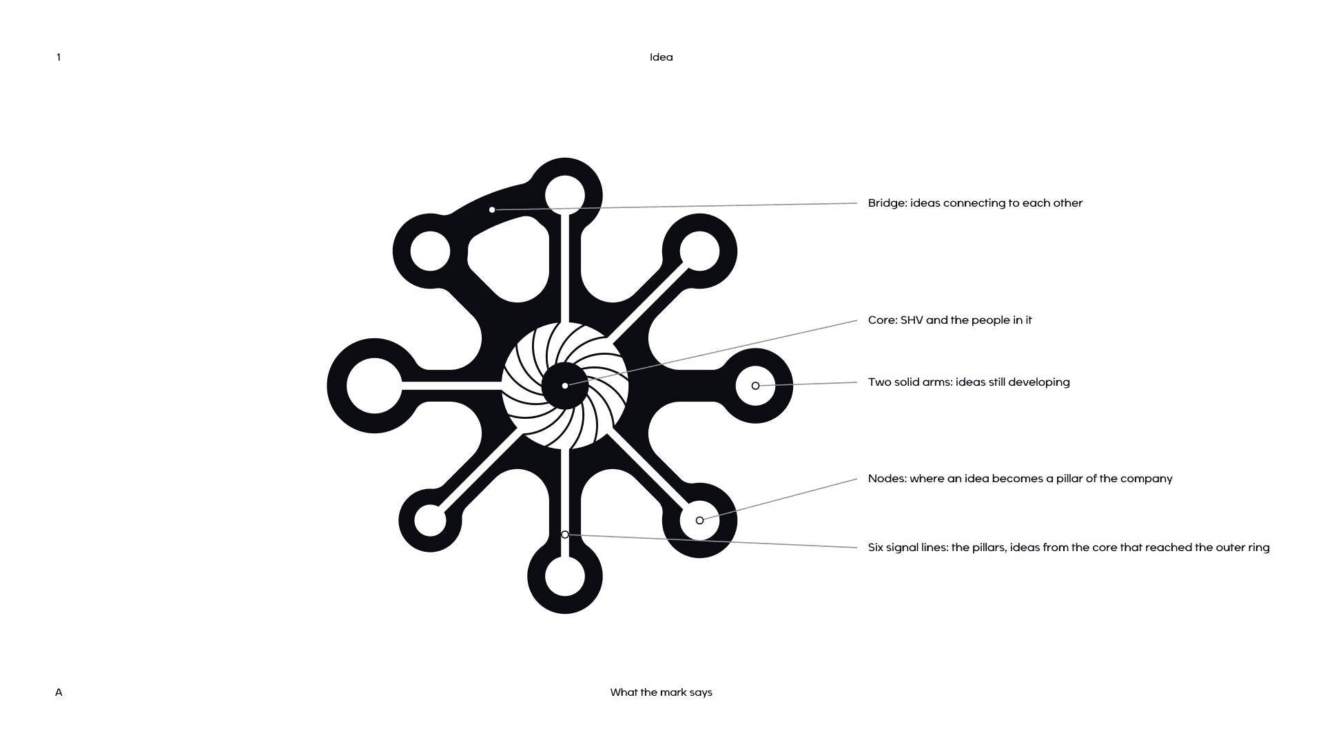
When we measured the original, its intentions were already there. Every node centre sat within 3% of one ring, every arm within 4° of a 45° axis, and the nodes came in three sizes. The redraw makes those intentions exact. Nothing was added or taken away: it still has eight arms, six signal lines, two solid arms, one bridge and a turbine with sixteen blades.
What it stands for
- The core is SHV and the people in it. The turbine inside it is the engine: sixteen blades turning around one eye.
- Six signal lines run from the core into a node. They are the pillars, ideas that started at the centre and grew into parts of the company.
- Two solid arms carry no signal yet. They are ideas still developing, and they stay in the mark on purpose.
- The bridge joins the north-west node to the north node along the outer ring, because ideas connect to each other and not only to the centre.
- Every node sits on one outer ring. However different the work, it is held to the same standard.
How it is built
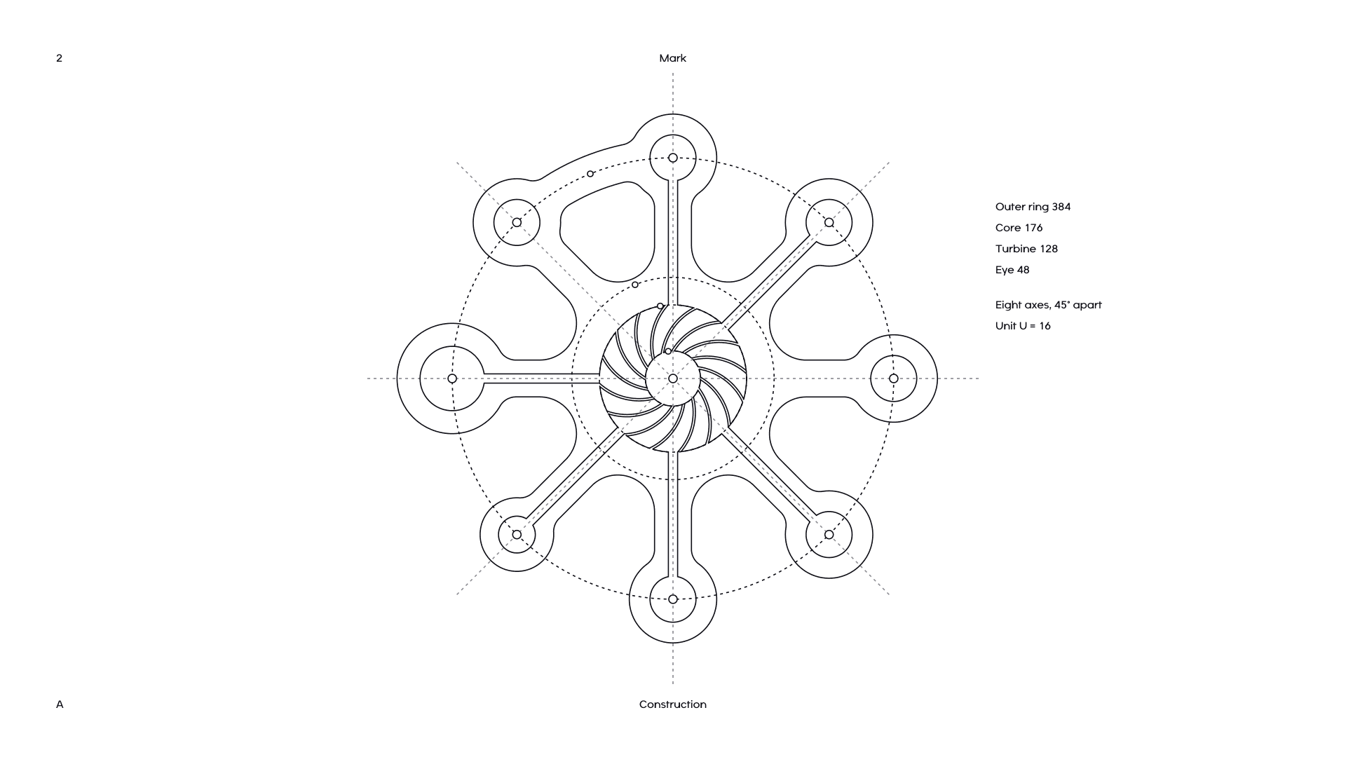
Every measure comes from one unit, U = 16, on a 1000 by 1000 canvas with the eye at the centre. The outer ring has a radius of 384 (24U), the core 176, the turbine 128 and the eye 48. Arms are 64 wide and signal lines 16. Each of the turbine's sixteen separators is a single arc of radius 104, repeated every 22.5°.
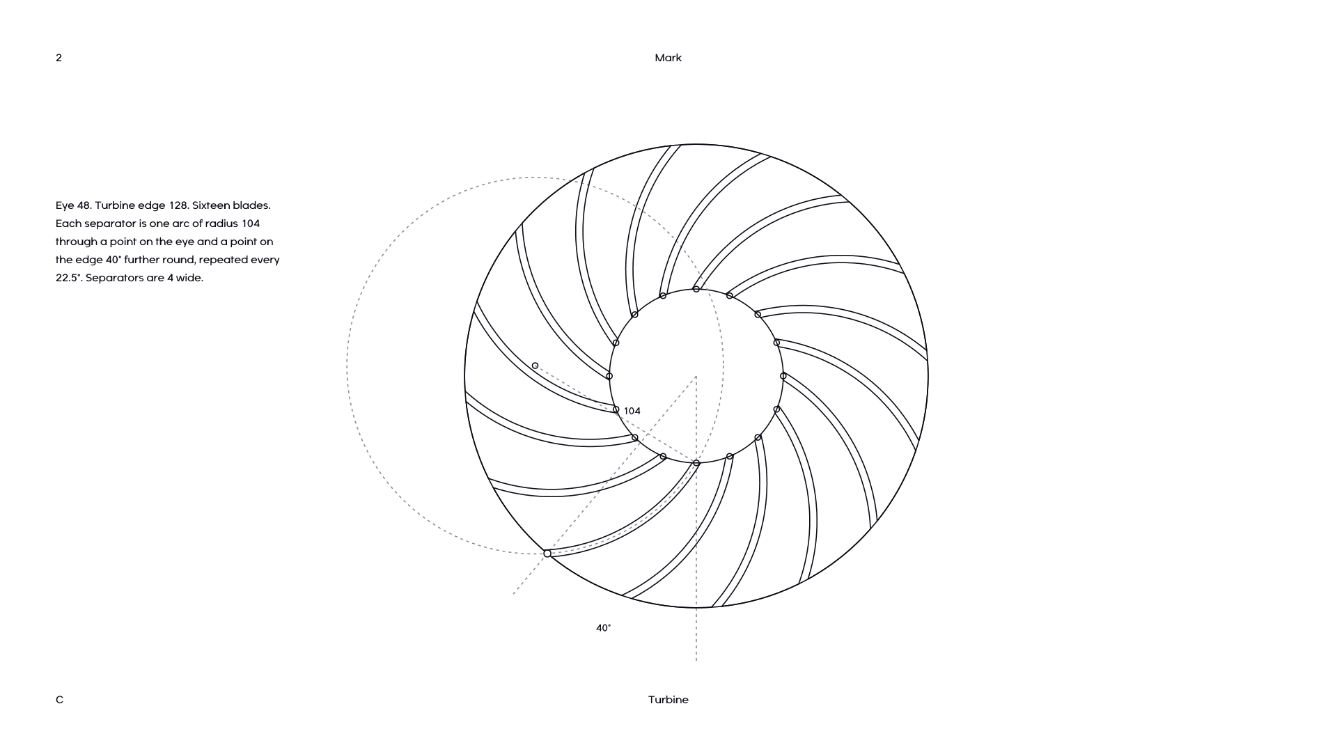
Fine detail does not survive at small sizes, so there is also a small mark for anything from 16 to 47 pixels. It turns the turbine into a plain ring and closes up the signal lines. That is the version in your browser tab.
The wordmark and the lockup
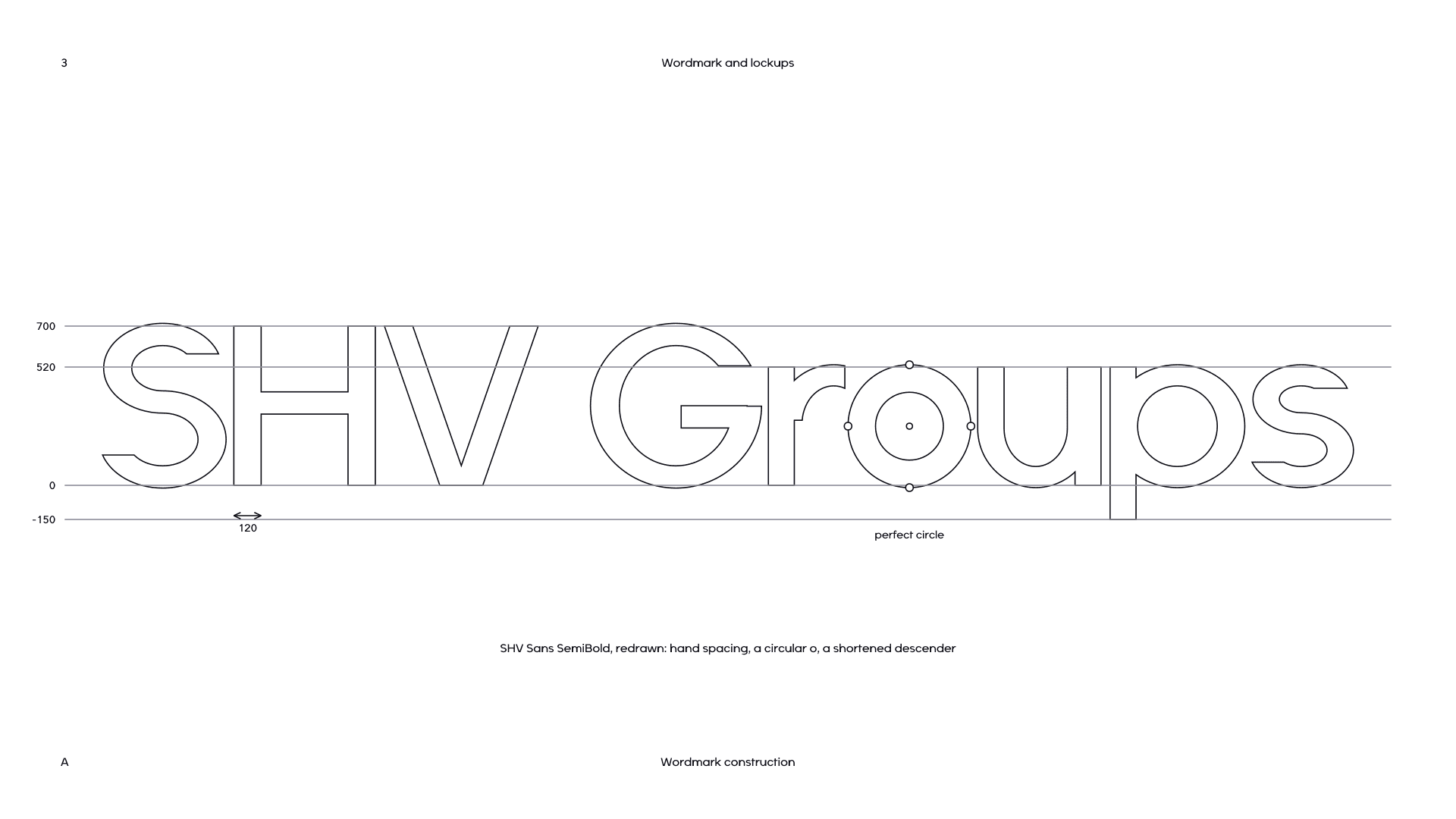
“SHV Groups” is drawn from SHV Sans SemiBold and then treated as a drawing, not as typed text. The spacing is set by hand, tighter than the typeface’s own. The o is a perfect circle, like a node. The descender of the p is shortened from 210 units to 150, so the word sits compactly beside the mark.
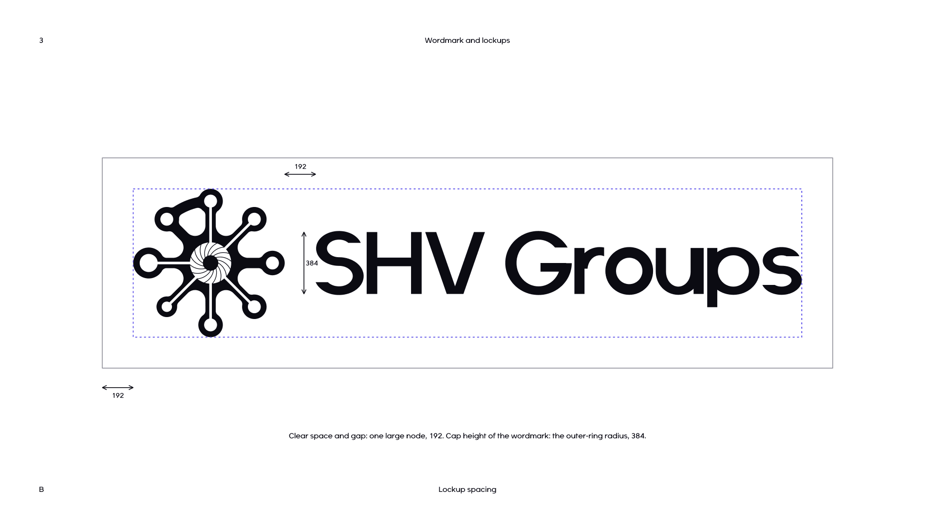
In the lockup, the wordmark’s cap height equals the radius of the mark’s outer ring, the gap between the two is one large node, and the wordmark is centred on the mark’s eye. The lockup is now in the header of this site, and the wordmark on its own sits at the foot of every page.
SHV Sans
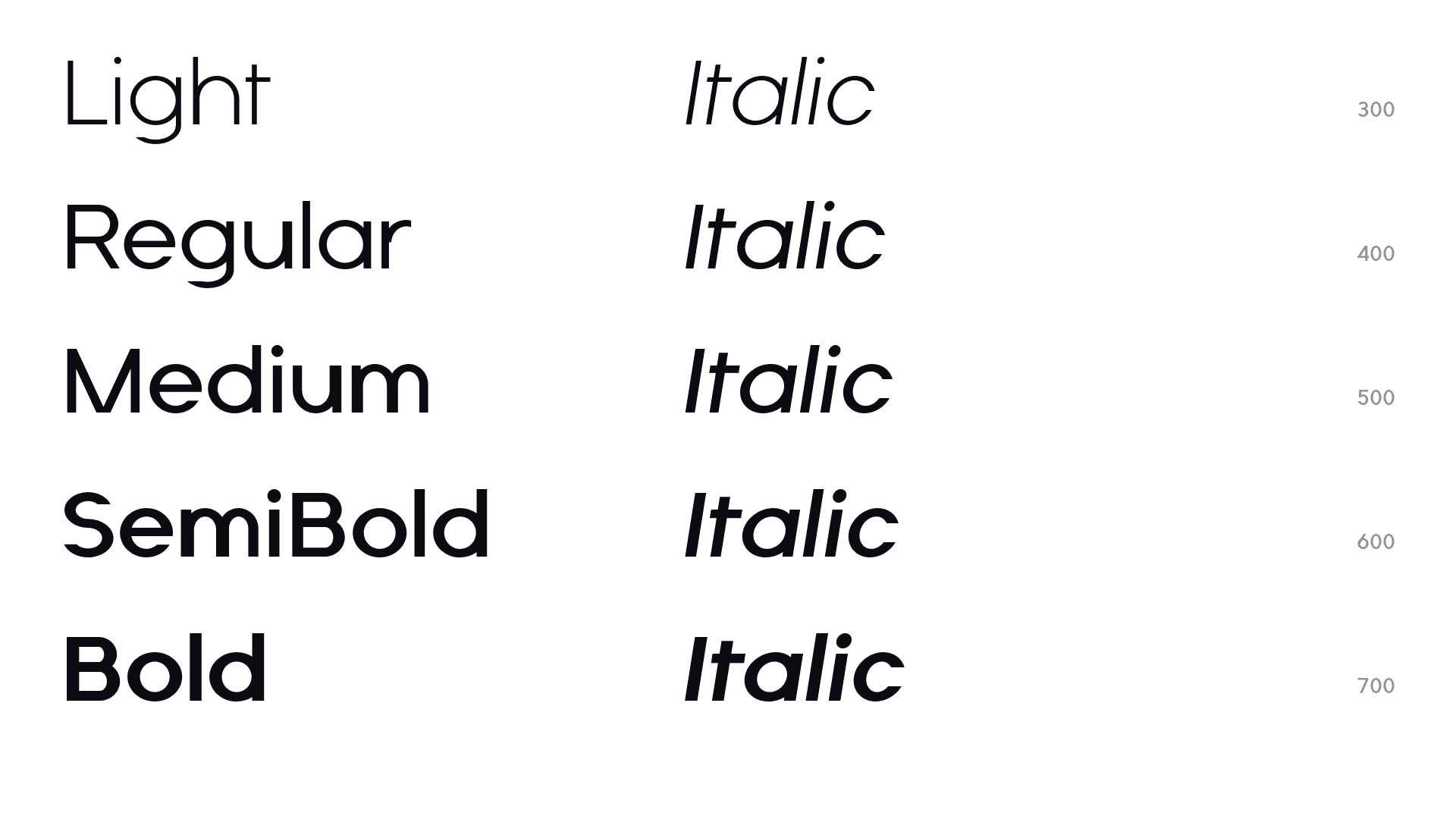
SHV Sans is our own typeface, and from today it sets every word on this site. It is built the way the mark is built, from true circles and ellipses, straight stems and horizontal terminals.
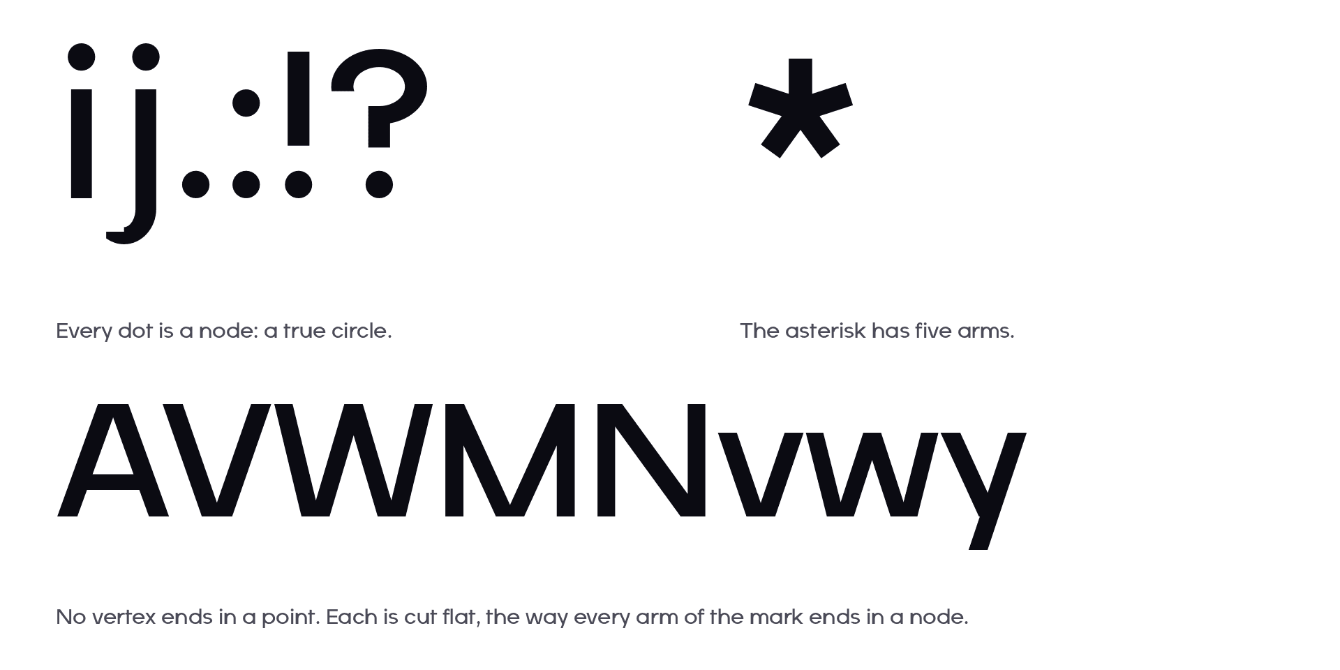
- Every dot is a node. The dots of i and j, the full stop, the colon and the exclamation mark are true circles.
- No vertex ends in a point. A, V, W, M and N, and v, w and y, are cut flat where their strokes meet, the way every arm of the mark ends in a node.
- The asterisk has five arms.
- Figures are tabular, so numbers line up in tables.
It comes in five weights, Light to Bold, each with an italic slanted 9°. The character set covers Latin-1 and Windows-1252, the rupee sign, and Greek Δ and Ω, which we needed for Eunoia Omega.
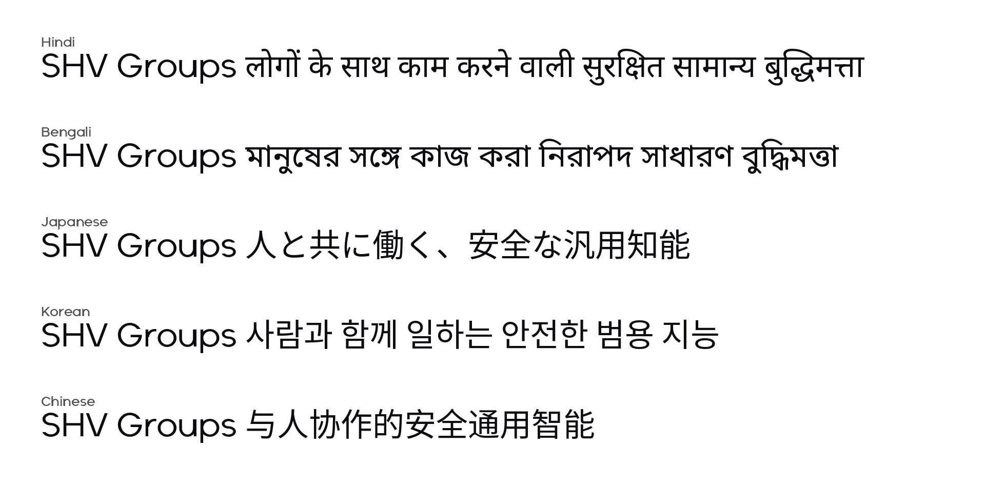
For scripts SHV Sans does not draw, it is paired with Noto Sans, sized and weighted so the two read as one voice: Devanagari and Bengali at 95%, and Japanese, Korean and Chinese at 97%. On this site that happens under one family name, so a page in Hindi or Bengali is set in the same voice as a page in English.
Colour
The colours did not change. Ink, paper and SHV Violet are the values this site already used; the guidelines now fix them as the standard and give each a Pantone match for print. SHV Violet is brighter than any Pantone solid, so for print we specify 266 C and approve it against the screen colour. Sky is kept for charts and graphics, and a deep blue for full-bleed dark sections.
What changes today
- The new lockup in the header and the wordmark at the foot of every page.
- SHV Sans across the site, including the share images that appear when you post a link to us.
- A new favicon and app icon.
- Logo files, and the rules for using them, on our Press page.
We have not drawn an icon set yet. Until we do, the site uses plain outline icons. When we draw one, it will follow the mark’s rules: true circles, 45° angles, and a round node wherever a point would otherwise be.